
bowlsome smoothie
creating a seamless self-service ordering experience
Bowlsome Smoothie is a popular and growing smoothie brand that focuses on offering healthy and customizable smoothie bowls. With several physical locations already established, they are now looking to enhance their customer experience by introducing a self-service smoothie bowl ordering kiosk. By leveraging this technology, they aim to provide customers with a convenient and efficient way to order and customize their smoothie bowls without waiting in line for counter service.
1. client objectives
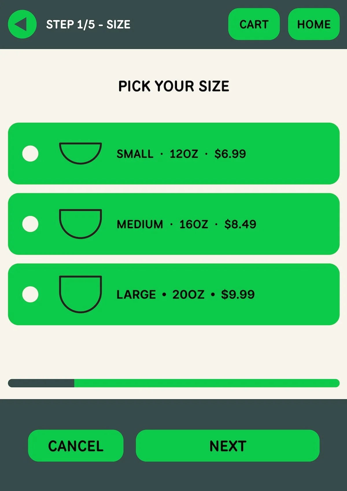
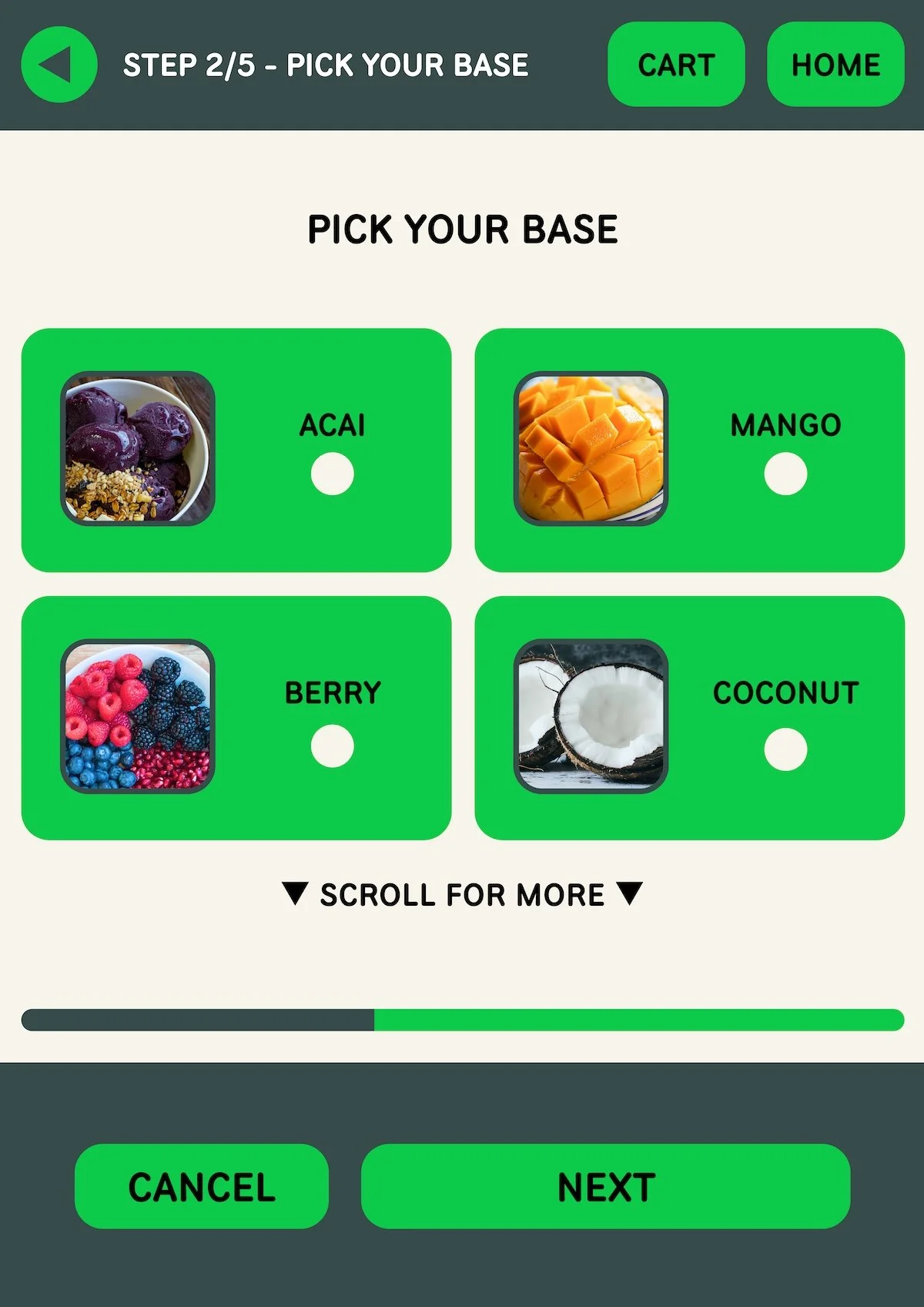
The primary objective of Bowlsome Smoothie is to enhance the overall customer experience by offering a self-service option through the smoothie bowl kiosk. This will reduce waiting times and allow customers to order their customized smoothie bowls quickly and easily. The client wants the kiosk to provide customers with a wide range of customization options. Customers should be able to select the size of their smoothie bowl, choose from a variety of ingredients, add-ins, and toppings, and have the flexibility to create their own unique combinations.
2. research
user personas

Name: Sarah
Age: 29
Occupation: Marketing Manager
Sarah is a 29-year-old marketing manager who leads a busy lifestyle. She strives to maintain a healthy diet despite her demanding work schedule. She often grabs a quick meal during her lunch break and looks for nutritious options that provide sustained energy throughout the day.

Name: Kia
Age: 25
Occupation: Personal Trainer
Kia is a 25-year-old personal trainer who leads an active and fitness-oriented lifestyle. He pays close attention to his nutrition and aims to consume meals that support muscle recovery and overall health.

Name: Hayden
Age: 19
Occupation: Student
Hayden is a 19-year-old college student juggling classes, assignments, and part-time work. She often finds herself on the go and seeks quick and affordable meal options that can be enjoyed between classes.
3. key insights
keep choices simple
show progress clearly
provide instant feedback
4. information architecture
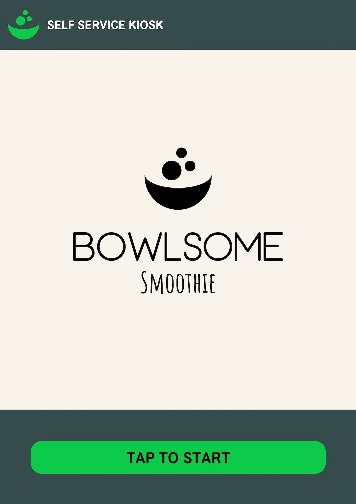
Welcome → Size → Base → Mix-ins → Toppings → Review Bowl → Payment → Confirmation
7. visual design
color palette





typography

8. prototype
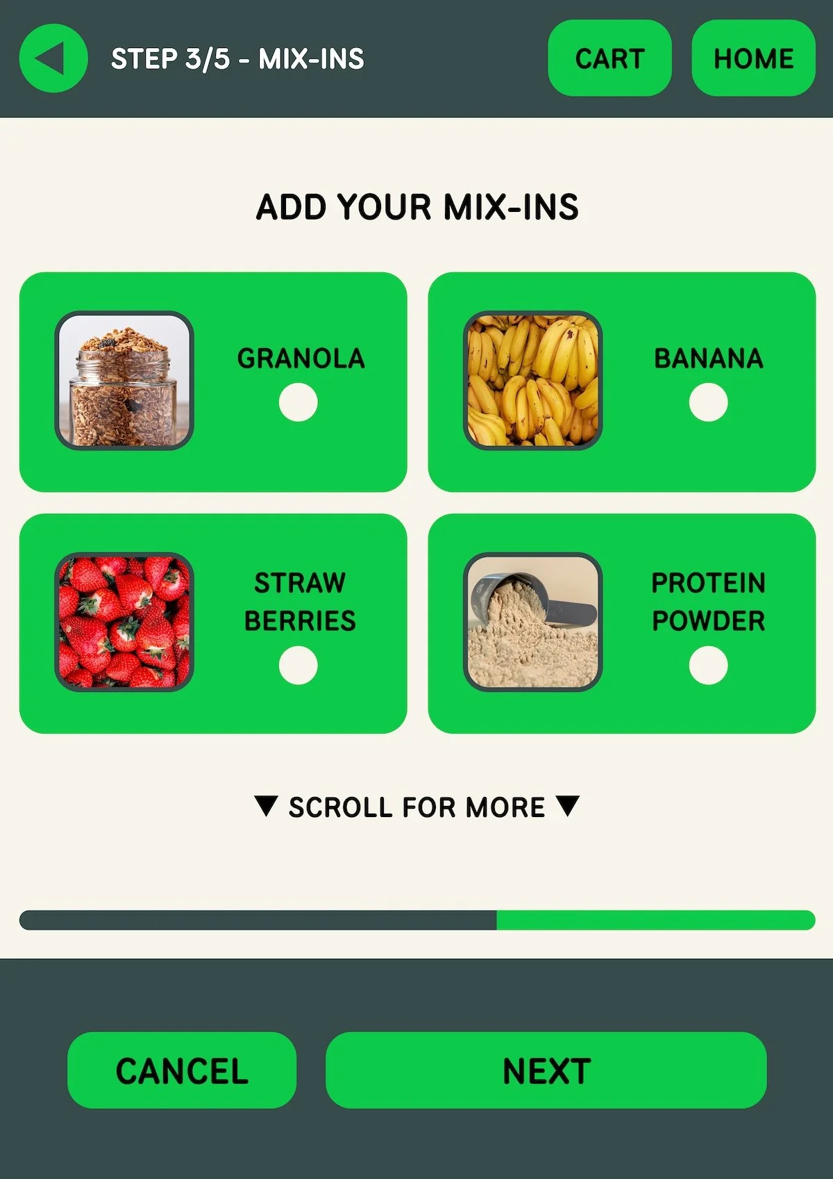
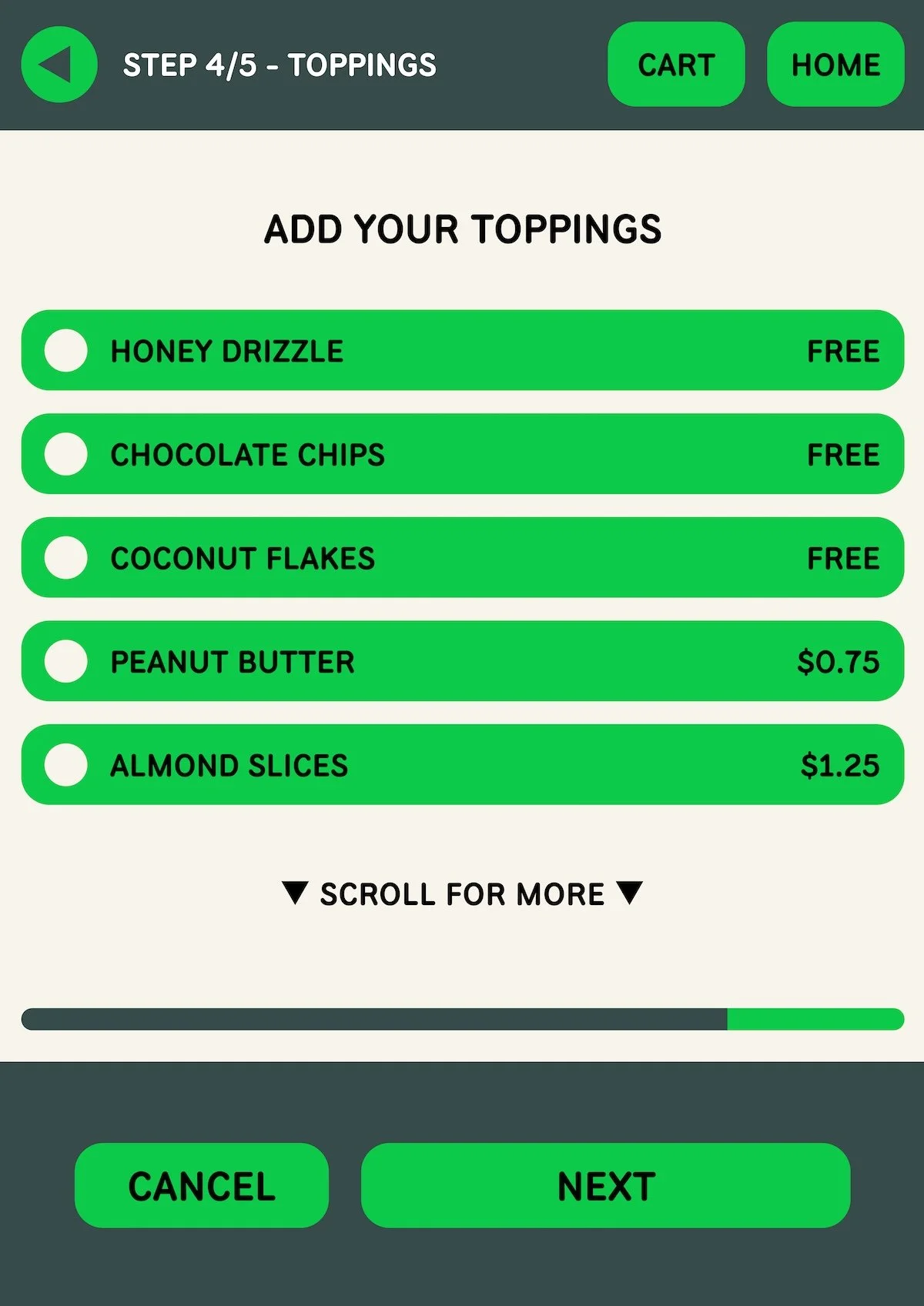
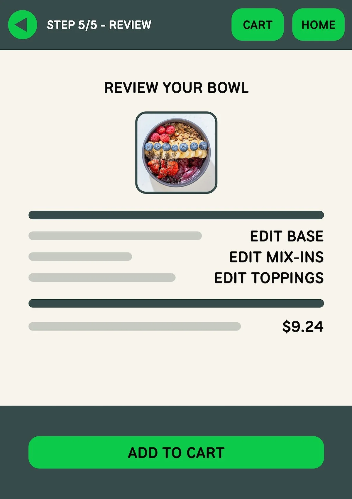
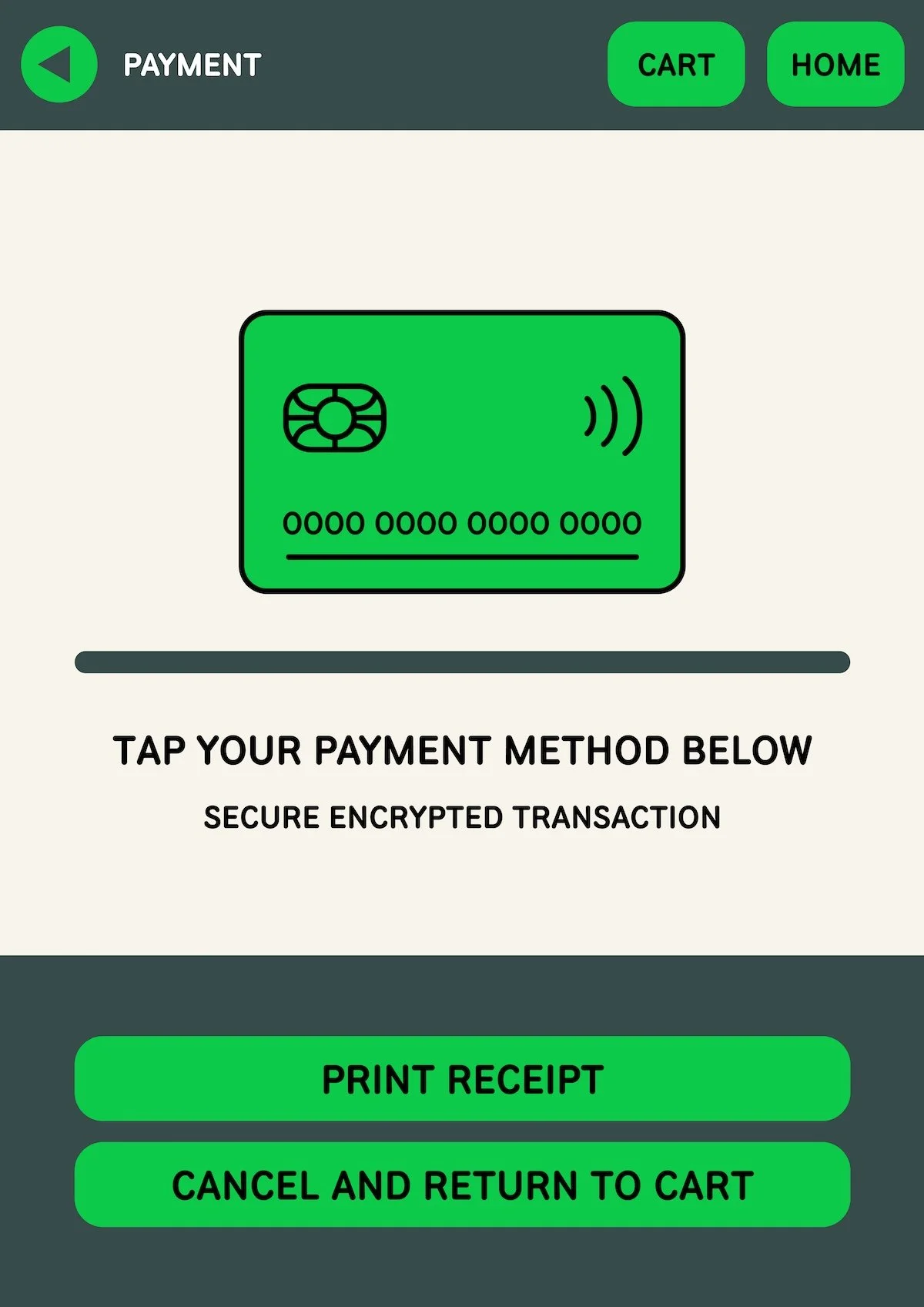
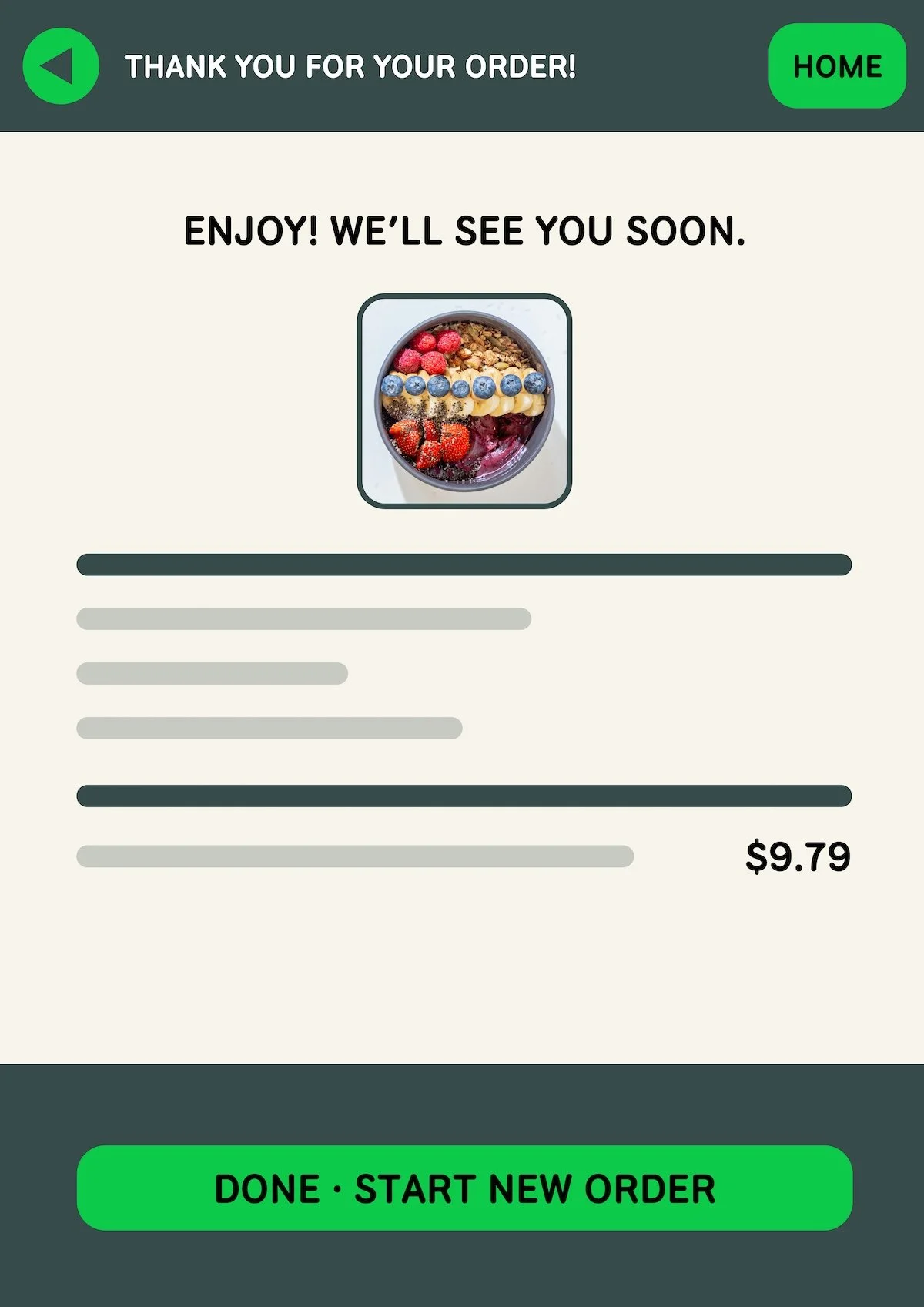
9. final solution
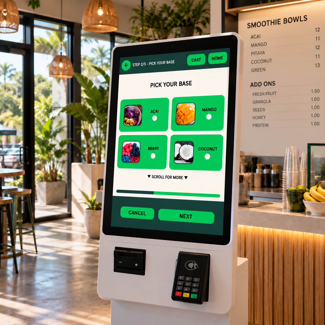
10. results
clearer customization
streamlined ordering
accessible kiosk interactions