stay humble tattoo co.
designing a better tattoo booking experience
Stay Humble Tattoo Company has built a strong reputation and loyal following, but its website experience makes it difficult for new clients to quickly find artists and book appointments. The goal of this redesign is to improve artist discovery, increase booking inquiries, and create a digital experience that reflects the premium quality of the studio.
➀ the problem
There’s no clear primary call to action
Users don’t immediately know how to book
The artist work isn’t the hero image
The homepage feels text heavy
Not mobile friendly
➁ research
user persona

Name: Nate Williams
Age: 34
Occupation: Construction
Nate works long days managing construction projects throughout the Baltimore area. Between early mornings, job site responsibilities, and family commitments, he has very little free time. He enjoys collecting tattoos and prefers working with artists who specialize in styles that match his vision, but he often finds tattoo shop websites difficult to navigate and time-consuming to browse.
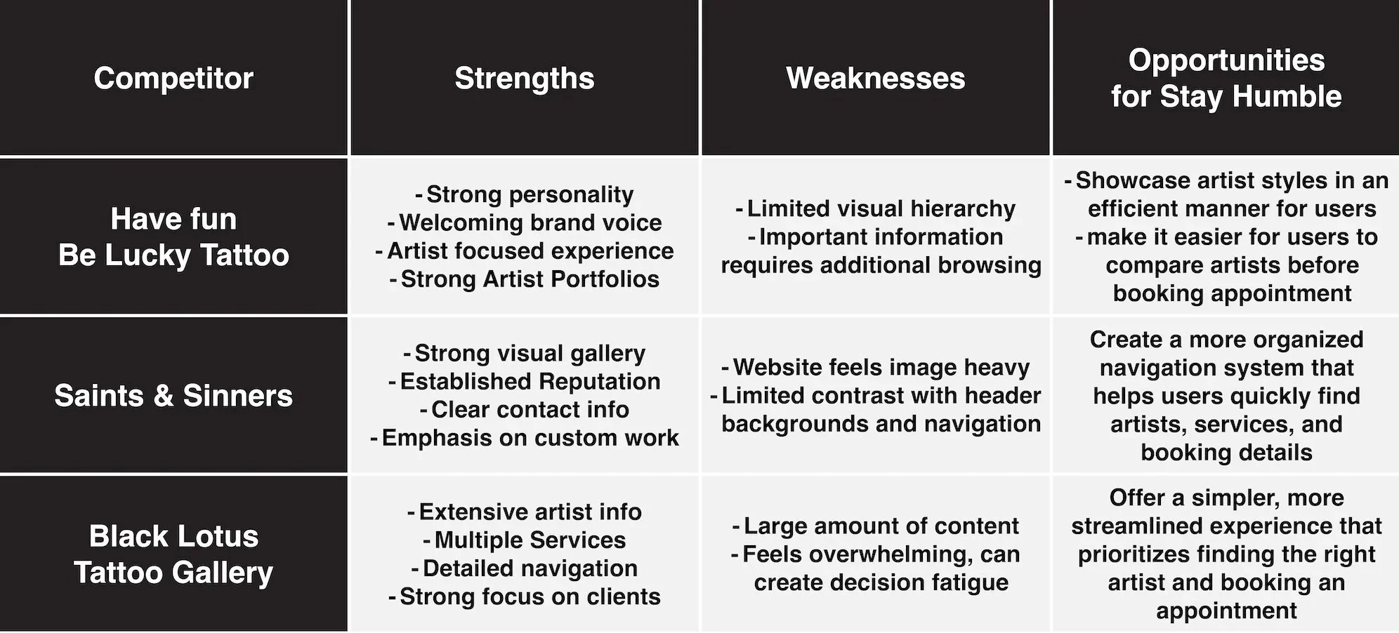
competitive analysis
➂ key insights
users need fast and easy access to book an appointment
website needs to contain organized information, artists and their work
website is outdated and hard to view on a mobile phone
➃ information architecture
card sorting
sitemap
➄ user journey
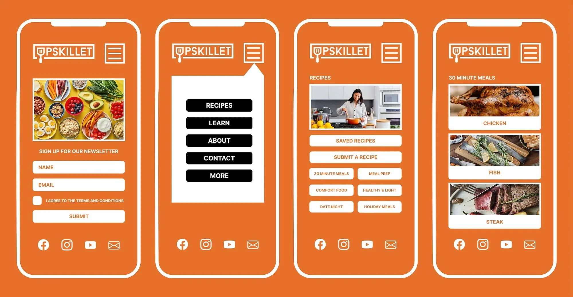
➅ wireframes
design desicions
simplified navigation
reduced clicks
improved hierarchy
➆ visual design
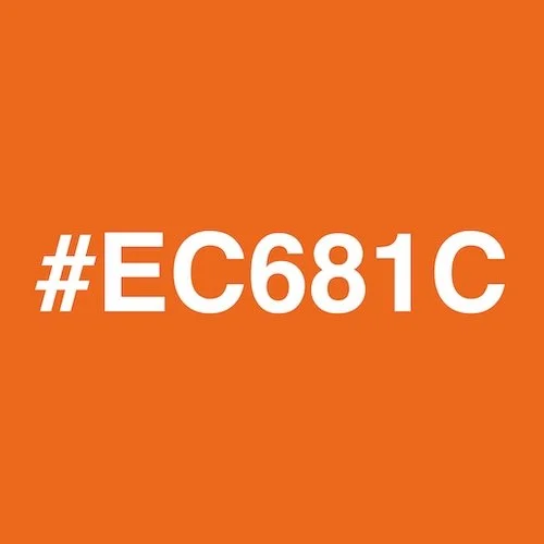
color palette


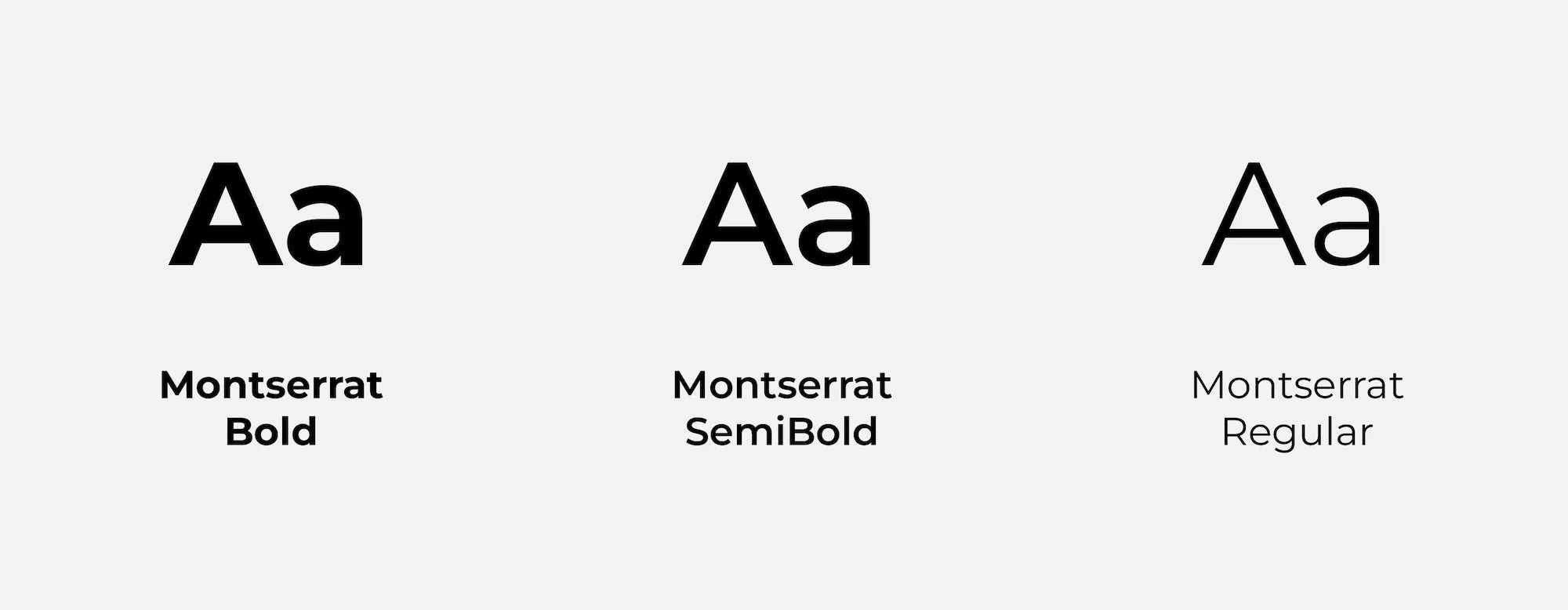
typography
icon set
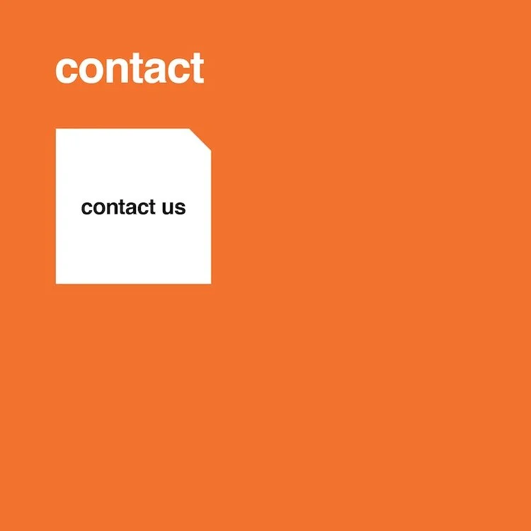
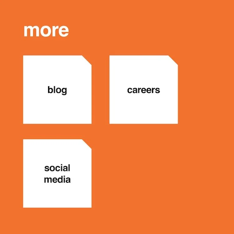
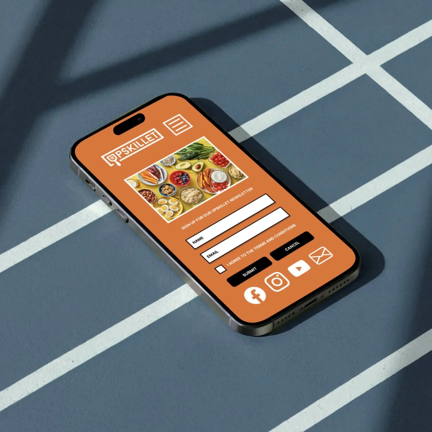
➇ prototype
➈ final solution
➉ results
clearer navigation
better user flow
improved discoverability