
upskillet
refreshing upskillet through better ux
UpSkillet is a recipe and cooking platform that needed a cleaner, more intuitive experience. I redesigned the platform to improve usability and overall user flow. The existing information architecture made it difficult for users to quickly find recipes, cooking classes, and content across the app. My goal was to simplify navigation, improve content organization, and modernize the overall interface to create a smoother and more engaging user experience.
1. the problem
users struggled to find recipes
navigation was confusing
user journey lacked efficiency
2. research
user persona

Name: Aya
Age: 28
Occupation: Lawyer
Aya is a lawyer, which requires her to work long hours and be on call most of the week for her clients. This means that she does not have a lot of time to dedicate to meal prep when she gets home. Aya wants to easily search for recipes that take less than 30 minutes to prepare and be able to add them to a list of favorites so she can quickly find them.
competitive analysis
competitive analysis results
I conducted a competitive analysis to understand what similar recipe platforms do well and where they fall short. By evaluating sites like All Recipes, Tasty, and Food Network, I identified opportunities for UpSkillet to create a cleaner experience, simplify navigation, and make recipes easier to find.
3. key insights
users wanted faster access to recipes
mobile navigation needed simplification
search was difficult to locate
4. information architecture
card sorting
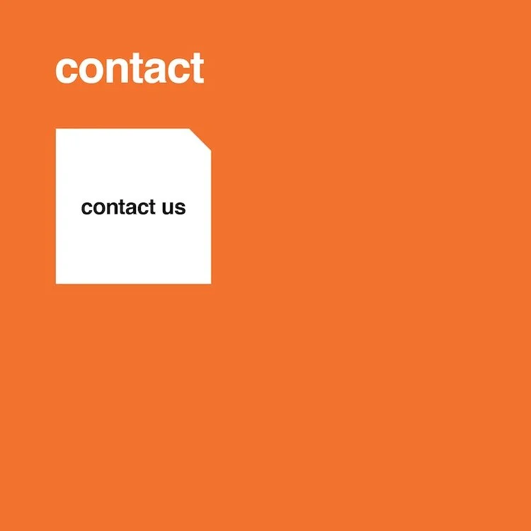
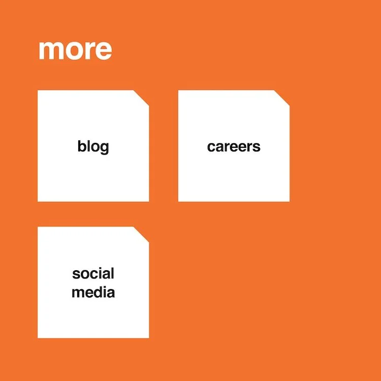
card sorting results
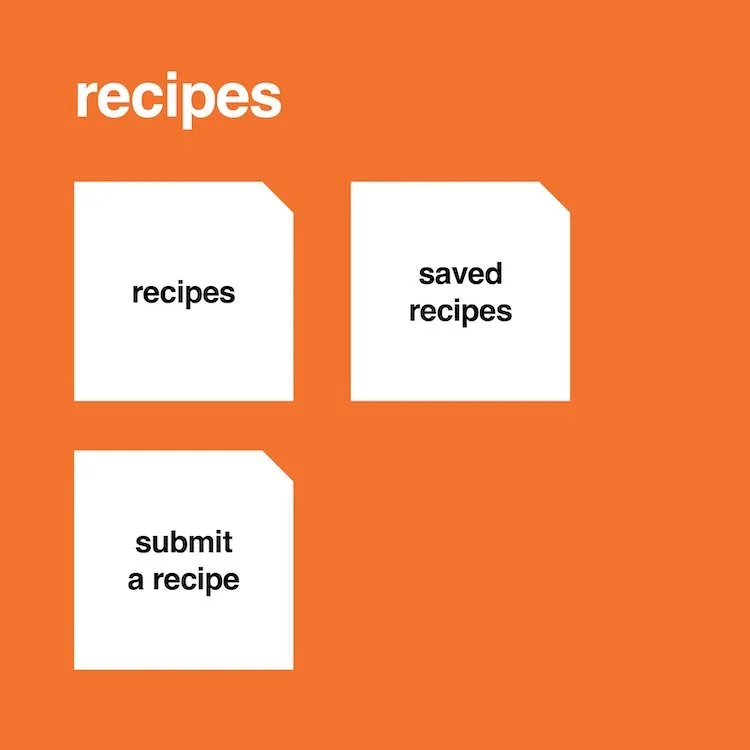
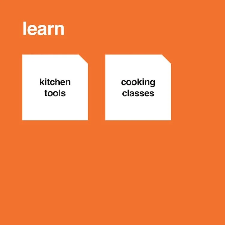
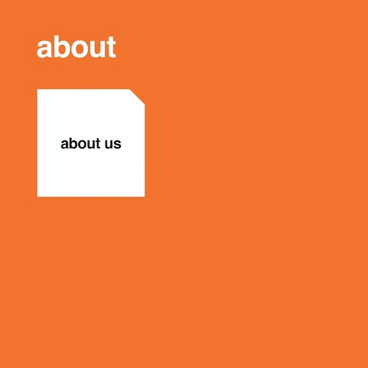
The card sorting exercise produced slightly different results across users. While most content was grouped similarly, there were differences in how users organized the About, Contact, and More sections. Based on these findings, I felt it was more intuitive to keep About and Contact as standalone navigation items, while grouping secondary content such as the blog, careers, and social media under a More category. This helped keep the navigation organized and focused on the platform’s primary content.
sitemap
design rationale
I organized the sitemap to make it easy for users to find recipes and cooking resources without digging through multiple pages. Since recipe discovery is the main reason users visit UpSkillet, it was given priority in the navigation, while supporting content was grouped into sections that keep the experience simple and easy to navigate.
5. user journey
6. wireframes
design desicions
simplified navigation
reduced clicks
improved hierarchy
design rationale
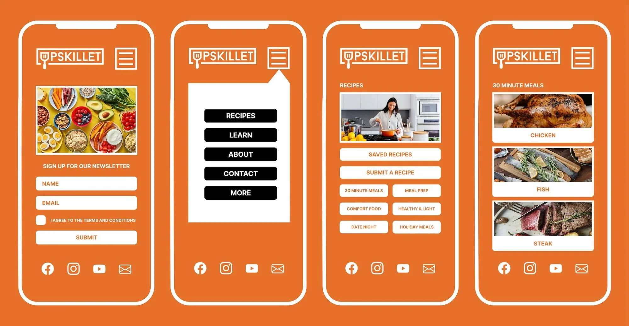
The primary goal of the initial wireframe was to help Aya, the user persona, find 30-minute meal recipes as quickly and efficiently as possible. Research showed that convenience and time-saving were big priorities, so the navigation was structured to minimize the number of steps required. Upon landing on the homepage, users can access the Recipes section from the main navigation and quickly filter to the 30-Minute Meals category, creating a clear path to their desired content.
7. visual design
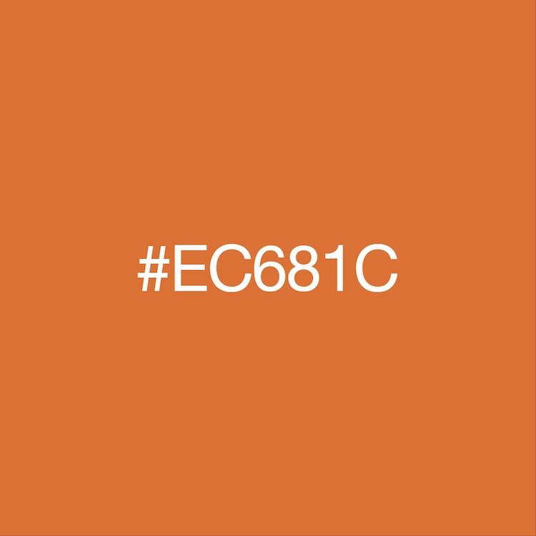
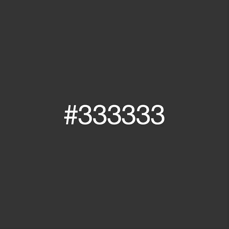
color palette




typography
icon set
design desicions
modern, clean aesthetic with intentional use of negative space
high contrast color palette to ensure accessibility and visual clarity
extended color palette built upon existing brand colors to maintain consistency while enhancing versatility
design rationale
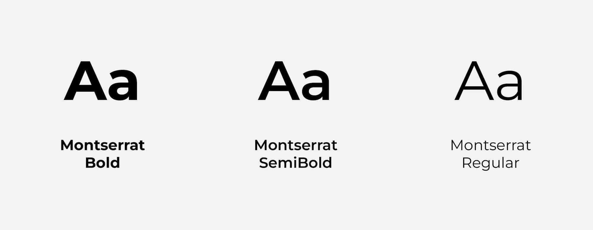
The visual design strategy was guided by adherence to the client's established style guide, with an emphasis on contemporary typography and a clean, structured layout. User research indicated that the primary audience skews millennial, a demographic that consistently favors streamlined, intuitive interfaces with minimal visual noise. In response, design decisions prioritized clarity and simplicity, avoiding unnecessary visual content while maintaining a polished and professional presentation.
8. prototype
9. final solution
10. results
clearer navigation
better user flow
improved discoverability